The post Our Bestselling Subway Tile in 5 Fabulous Spaces appeared first on The Tile Shop Blog.
]]>


You can find even more inspiration on Instagram and our Customer Room Gallery where our tiles are used in a variety of real spaces! Or, if you’re looking for some guidance on an upcoming project, set up a free design consultation to get advice from our tile experts.

The post Our Bestselling Subway Tile in 5 Fabulous Spaces appeared first on The Tile Shop Blog.
]]>The post Subway Tile Design Ideas & Tips appeared first on The Tile Shop Blog.
]]>history of subway tile

Created more than a century ago by architects Heins and LaFarge, the original subway tiles were used for, you guessed it, a subway—specifically the New York City subway in 1904. These tiles were perfect for subways because they were simple, clean and economical. They were so efficient that other major cities adapted subway tiles, from London’s Underground to Paris’ Metro. Soon, subway tiles became popular above ground as well, adorning Victorian kitchens and bathrooms because of their sanitary qualities.
Today, subway tiles are much more of a style statement, but that doesn’t mean they aren’t still functional and durable. Many people love them for this exact combination. However, there are more choices than ever to consider so knowing what is right for you can be tricky. That brings us to our top three things to consider when you pick out your tile.
Top 3 Things to Consider


Subway Tile Design Tips
Once you know what you want as far as size, finish and shape, it’s time to explore different subway tile designs and what makes them work.
Try using a patterned, wallpaper-look tile above a wainscot and subway tile in a complementary color on the bottom. This will add color and interest to a powder room, and you can still keep the palette neutral.

The vertical straight set pattern in the charming space below adds height to the small shower in a contemporary way. We love how this pattern continues right through the nook and brings mid-century modern style to this soothing room.

With subway tile, pattern is everything. In the frame below, a herringbone pattern defines a focal point without straying from a soft, neutral color palette. There are so many interesting details here to attract the eye.

Subway tile is wonderful as a blank canvas to support other points of interest. A dazzling waterjet mosaic (first photo) or an artistic piece of Laura Ashley art glass (second photo) stand out on a subway tile background. Grout in a complementary color helps the true centerpiece shine. To transition between your subway tile and focal point (and to show it off!), incorporate layering pieces that do double duty.


The character of brick and the versatility of subway tile come together in this beautiful space. An elongated tile in a herringbone pattern gives this cozy nook a unique, textured design.

One of the best things about subway tile is the variety of patterns possible. Here, a mix of vertical and horizontal straight stack on the wall lend a modern appearance and a bold, colorful pattern on the floor is a jolt of energy.

Ask Kirsty

You asked, she answered! Kirsty offers her advice on some of your most common subway tile questions.
How do I decide on a gloss or matte finish for my subway tile? Is gloss more timeless? What’s easier to keep clean?
Glossy finishes typically present a more traditional and elegant look. Their reflective quality can also make your space appear brighter. Matte finishes offer a more casual, relaxed appearance. They don’t reflect as much light and will give the space a softer look. As far as cleaning, both matte and glossy tiles have their benefits. Matte tile does not show smudges or splashes as easily as a glossy tile, but glossy tile is very easy to wipe down and clean.
What color grout should I use with white subway tile?
Grout has an incredible impact on your tile and the space around it. You have three options: matching, complementary or contrasting grout. The best option for you depends on your goals for the final look. Matching grout to the tile color gives a classic, clean, monochromatic and seamless appearance. A neutral and complementary grout color adds subtle contrast without being a focal point. Opt for a color that accents the tile and overall design. Contrasting your grout color to your tile adds character, creates a bold, dramatic look and shows off the tile pattern. The grout becomes a part of the design rather than the backdrop.

How do I match subway tile with my cabinets?
There is no one formula for matching tile and cabinetry. It’s about what appeals to you. One tip I recommend is to look at your closet. What color clothing do you have? To which colors do you tend to gravitate? Just like your clothing style, you want your home to reflect you and your individuality. It’s also important to think about contrasts. Do you want a monochromatic look or do you want your tile and cabinets to contrast one another? Deciding this will also help guide your tile choice.
What subway tile pattern should I use?
(Tip: Refer to our blog post on subway tile patterns and layouts for examples of these looks!)
The most popular layout is a traditional horizontal brick. To make that appear more modern, use a larger size tile. Vertical and horizontal straight stacks are more contemporary layouts. Any vertical pattern will add height to your space—an offset brick pattern is more traditional and a straight stack is more contemporary. More unique layouts, like crosshatch and herringbone, add dynamic patterns, whether in a monochromatic or multicolored palette. The beauty and glamour of a herringbone pattern are unbeatable.
Between all the shapes, sizes, finishes and patterns available for subway tile, there are countless designs to be discovered. However you decide to use subway tile, just make sure to follow The Tile Shop golden rule, and make it your own!
The post Subway Tile Design Ideas & Tips appeared first on The Tile Shop Blog.
]]>The post Timber Trails’ Refined Rustic appeared first on The Tile Shop Blog.
]]>
What inspired the overall look and design for Refined Rustic?
“Tile is always my starting point. It’s the first item I select for a home, and it sets the tone,” Julie said. “The Annie Selke tile used in the basement bath and the laundry room were just introduced by The Tile Shop, and I loved them. They are what set the tone.”
Eye-Catching Entrance

The entrance of your home should set the tone, and Timber Trails did exactly that. The black features, warm wood flooring and courageous wallpaper greet you with open arms.
Dining Room
Behold, the grand dining room. This stunning space is Julie’s favorite room in the entire house. “It is the first thing you see when you walk in. I love that the white paneled walls are offset by the black ceiling,” Julie said.

“When people see a design and say, ‘I never would have done that, but I love it.’ That’s when you know you’ve done your job as a designer.”—Julie Howard, designer for Timber Trails DC

The hallways in this home stretch as far as the eye can see, connecting you to countless uniquely designed rooms that stimulate and inspire.

Laundry Room
“We used Annie Selke Ikat Black in the laundry room because, to me, a laundry room should be fun. It doesn’t need to match the rest of the house because half of the time the door is closed,” Julie said. “Plus, who enjoys laundry? It’s nice to design a laundry room that makes you smile when you enter.”

“I’ve never been scared of black. I painted my first adult bedroom black 20 years ago, and it is still my favorite room I’ve ever designed,” Julie said. “It’s certainly caught on over the years as I’m seeing it on more walls and in more kitchens and baths. Black doesn’t date, and you don’t tire of it.”

Victoria Grey Bath

Victoria Grey marble defines luxury. Its versatility and stunning appeal makes it perfect for numerous styles. We especially love the eye-catching stone mosaic rug look framed by Victoria Grey stone.
Kitchen

While the tumbled marble softens the space for a traditional feel, the accents of white oak warm up the kitchen for rustic, farmhouse appeal. The sleek counter tops and appliances are incorporated for a flair of contemporary style. What do you get when you unite these amazing designs? The always trendy transitional style.

If the space wasn’t already perfect enough, the added elements of hygge, like greenery and wood features, add in the perfect sense of comfort. Read our blog post on what makes Scandinavian looks so chic!

Living Room

As a member of our Pro Network, Timber Trails DC has maintained a strong and meaningful partnership with the Lombard, IL location and store manager, Kevin. Together, Timber Trails DC and Kevin have completed over 40 homes!
“We have a great push and pull. He keeps me in check when I tend to go too far, and he’s on top of everything down to each tile I need,” Julie said. “Kevin makes me feel like I’m his only client, which is great when you call in a bind, which I often do!
Master Bath

Siberian Pearl marble accompanied by deep black and gold features—dramatic elegance at its finest!


“The marble in the master is so pretty because it is a white marble, but it has a lot of warm tones in it and is different than a white and grey Carrara marble,” Julie said.
Master Bedroom

Jack & Jill Vanity

How charming is this beach-inspired Jack and Jill bath? The repetition of the wood-look tiles on the wall and floor create such a pleasing, cohesive look.
Basement Bath
We end this home tour with one of our favorite spaces in the house: the basement bathroom. This space encompasses the three colors that are used throughout the house: black, white and brown.
We love the juxtaposition between the black and white features in this bathroom. While the patterned floor tile proudly catches your eye, the shower tiles contrast the bohemian pattern with a classic, solid-white subway. Notice the black grout lines in the shower—darker colored grouts create more character and add a more pronounced look to the grout joints.

Stay up-to-date with Timber Trails DC and all of their stunning builds by following them on Instagram.
Are you a home developer or interior designer? Let’s partner on your next project. Join our Pro Network program and receive specialized pricing and services.
All photography by Stoffer Photography Interiors
The post Timber Trails’ Refined Rustic appeared first on The Tile Shop Blog.
]]>The post Spring One Room Challenge™ Reveal appeared first on The Tile Shop Blog.
]]>
This spring, we had the honor of being an official sponsor of the One Room Challenge. Twice a year, 20 designers/influencers take on the challenge of transforming an entire room in just six weeks. Each week, the official participants share an update on the progress of the space. Luckily for us, the three designers we supported revealed some outstanding spaces at the end of the challenge. We hope you enjoy each of these spaces as much as we did!
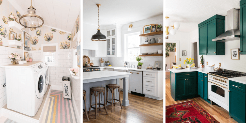
At Home with Ashley
The first space by At Home with Ashley is one of the most uplifting laundry rooms we have ever seen. We realize that might sound like an oxymoron, but just see for yourself!


From classic white subway tile to rainbow painted flooring, Ashley incorporated numerous elements to bring this space to life. Ashley designed this space with so much bubbly character that it even had us wanting to invite ourselves over to do a few loads of laundry!

White subway tile is perfect for adding an attractive look to a space without taking attention away from bold accents and focal points. In Ashley’s laundry room, the tile perfectly supports the vivaciously patterned Euphemia 5 Wallpaper.

“To me, subway tile is still a classic look that feels very appropriate in our 1905 house. To modernize the tile, I added gold trim,” Ashley said. “The space feels so clean now with the walls of tile, which seems perfect for a laundry room!”
Visit At Home with Ashley’s Instagram or view her entire One Room Challenge space.
House of Jade Interiors
Picture a modern country kitchen—the type of kitchen that provides the perfect combination of warmth and charm. House of Jade Interiors took that idea and perfected it.


The magnetizing, modern and rustic features bring this modern farmhouse to a whole new level. While the backsplash reflects twenty-first century beauty, the tile’s handmade look and texture create a tranquil, artisan appeal.

We are obsessed with all of the organizational features in this kitchen. Take the center island for example— these gorgeous grey cabinets accent the white cabinetry and wood flooring perfectly.

House of Jade Interiors incorporated both glass cabinetry and open shelving in the images below. The combination of concepts truly give the feeling of modern farmhouse.

Notice the unique feature of tile inside the glass cabinets in the image above! We love this subtle feature because it adds texture and gives the enclosed cabinets a simliar feeling to the open concept cabinetry. If you love open shelving as much as we do, check out our Kitchen Trends for 2019 blog post.
Visit House of Jade Interiors’ Instagram or view their entire One Room Challenge space.
Jessica Brigham
Jessica Brigham’s wondrously green kitchen had us jumping for joy the moment we saw it! Jessica glamorized her 1934 craftsman bungalow kitchen while still paying tribute to its original, vintage character.

Check out the final kitchen reveal in the image below. The Forest Green cabinets are probably the highlight of this charming kitchen, but we can’t deny our love for the delightfully textured backsplash (even if we are a little biased). Let’s discuss the three reasons why we love this backsplash.

Firstly, the tile. The Penny Round Gloss White Mosaic wall displays a texture that is absolutely inspiring. Since the tile and grout are both white, the tile perfectly blends together—almost disappearing into the wall as if were an illusion. But if you look closely, the glossy finish seductively pulls you in.
Secondly, the counter-to-ceiling tile design. This trend is perfect for adding height and a cohesive look to your space. Even Jessica said installing tile from countertop to ceiling was the best decision she ever made.

Thirdly, the brushed gold and brass features. These accents of glam seamlessly fit in with the contemporary yet vintage kitchen. Notice the gold profile trim along the ceiling line in the image above and at the edge of the backsplash in the image below. These chic trim accents effortlessly united with the aged brass lighting and brushed brass wall plates.

“These itty bitty pennies brought in a subtly glamorous, glossy grandeur to the space—a little razzle dazzle, if you will.”—Jessica Brigham

Jessica’s colorful cabinetry just so happens to be one of our 2019 kitchen trends. Check out the rest of this year’s latest kitchen designs now.
Visit Jessica Brigham’s Instagram or view her entire One Room Challenge space.

Are you looking for more renovation inspiration? Check out these talented ORC guest participants: Sincerely, Marie Designs, Handmade Weekly, A Life Unfolding, This Minimal House, Porch Day Dreamer and Brush Colored Glasses.
The post Spring One Room Challenge™ Reveal appeared first on The Tile Shop Blog.
]]>