The post Guide To Layering Tile Trim And Profiles appeared first on The Tile Shop Blog.
]]>
Customizing Your Space
We’re sharing our best practices for layering tile to show you how you can take your space to the next level. The look below incorporates a combination of trim pieces and mosaics to transform a simple picture frame into an exquisite focal point.

Since this bathroom uses the Firenze Carrara marble collection throughout, the untrained eye may see it as quite simple. Look carefully at the transitions, and see if you can identify how many trim pieces are actually used to accomplish this sophisticated design.

Incorporating different shapes and sizes from the same tile collection can carry this elevated look through to other areas of the room, such as the backsplash, half wall

Thoughtful Transitioning
It’s important to think about how each part of your space will work together to form a unified environment. Utilizing trim pieces between different materials, sizes, shapes

Dimensional tile can create dramatic depth and texture, but it can also leave an uneven edge when paired with other selections (top left photo). Incorporating transitional trim pieces will offer a seamless solution from one style to the next. Similarly, they can be used on the floor to separate different areas within a space – the top right photo displays a subtle transition, while the photo below incorporates durable curb pieces for a more prominent separation from shower to floor.

For tiles that vary in size, double up somersets and run them vertically for the greatest impact.

Using transitions is also the perfect way to emphasize an accent tile in your design. In the photo below, layered trim pieces instantly elevate the Brushed Bronze with Glass Metal Mosaic backsplash, while coordinating beautifully with the surrounding ceramic subway tile.


Each trim piece has its own unique characteristics that make it perfect for specific uses.
Coordinating Finishes
Pictured below is an example of how trim and profile pieces can provide an opportunity to coordinate with fixtures. In cases where there’s no need for a transition or storage solution, metal profiles can be used in between tiles as a unique accent that can coordinate with other design elements, such as faucets or lighting.

Layering trim and profile pieces can make every tile design better by adding dimension and interest. It
When And Where To Layer Tile

4 Design Plans With Layered Tile
Need ideas for your next remodel? Here are a few examples of design plans that incorporate tile trim and profile pieces. Bring them into your local store or schedule a design consultation to discuss dimensions, quantity, styles and more.

Learn more about layering in our comprehensive guide to trim and accessories. Ready for the next step? Schedule a design consultation with a tile design expert today!

The post Guide To Layering Tile Trim And Profiles appeared first on The Tile Shop Blog.
]]>The post Our Favorite Tiled Bars appeared first on The Tile Shop Blog.
]]>This coffee-to-cocktail bar from the 2019 Fall One Room Challenge™ is a sight to behold! Nicole from Nicole White Designs opted for a bold, art deco tile and it paid off in a big, statement-making way.


This classic, simple bar can be dressed up or down for whatever purpose you want it to serve.

This welcoming rustic bar is the perfect place for a hot cup of coffee.

A crisp white backsplash is the perfect contrast to bold cabinetry.

A mirrored bar ups the glamour factor—perfect for entertaining and hosting!

A tiled bar is the perfect place to take a risk. Adding bold hues or patterns is one easy way to make your bar stand out. It’s meant to be a fun spot, right?

Shiplap walls, sea-green cabinets and a mosaic in a mix of soft neutrals combine to form a relaxed, beachy bar.

Want to achieve glamour without going too bold or dramatic? This gold mosaic adds just the perfect amount of glitter to make it special.

This Annie Selke tile featuring flecks of metallic gold create a soothing visual break from dark shelves and cabinets.

What to do with this in-between-rooms nook? Make it into a functional and beautiful bar, of course!

Reclaimed wood tiles are the perfect backdrop to this natural wood bar in a cozy basement.

On that note, we’re feeling a little thirsty. Don’t forget to share your Tile Shop tiled bar on our social media channels with #thetileshop. Ready to start your own project? Get started with a remote design consultation today!
The post Our Favorite Tiled Bars appeared first on The Tile Shop Blog.
]]>The post Stay Up-to-Date With This Current Style appeared first on The Tile Shop Blog.
]]>
Hallmarks
A few of the clues that you might be looking at contemporary design are:
- A minimalistic feel
- Clean colors, often neutrals
- Hidden or integrated appliances and features
- An emphasis on natural light
- Flat-panel cabinetry
- European cabinet pulls or no hardware
- Stainless steel
- Recessed and pendant lighting
- Artistic elements

Accessories can go a long way towards establishing a contemporary theme in your space. The furniture, decor
Tile Style
This design style is somewhat unique in that not only can tiles be worked into your contemporary design, but tiles can display contemporary style in and of themselves.
Some characteristics of contemporary tiles are:
- Large format
- Sculptural
- Straight stack vs. brick layout
- Stainless steel (like in a mixed-materials mosaic)
- Simple profiles with clean edges
- Art-inspired elements
- Geometric shapes
Myriad different tiles can facilitate contemporary style, and this is just a short list. Scroll to the bottom of this blog post to view some of our favorite contemporary tiles.
Along with a sleek, contemporary chandelier and tub, these wall tiles are perfect examples of this style. They are sculptural, artistic and bold.

There are a few contemporary elements to note in this space: the artwork, sleek furniture, an unadorned fireplace and a geometric patterned rug.
Just like tile and lighting, furniture can display contemporary characteristics all on its own. If you are thinking of decorating in this style, consider items like the below.

The shower above is an embellished and glamorous take on contemporary. The large-format tiles, squared-off trim pieces and sleek hardware are all indicators that it is contemporary. In the close-up below, the square and straight edges of the trim pieces are more visible. As opposed to an ornate or rounded piece of trim, these finish the installation without adding any extra adornment, keeping the look minimal and sleek.

Here are a few more contemporary trim pieces with squared-off edges and clean lines that work well in this design style. Read more about layering and trims on our blog post.
Below, neutrals and unadorned cabinetry make this space contemporary. A honed finish on the marble-look tiles and bright wood vanity warm the room up.

From the minimal, artistic decor to the sculptural, monochromatic wall tiles, this fireplace is thoroughly contemporary from top to bottom.

Sculptural tiles are not only perfect for contemporary design, but they’re also a big trend right now. Explore some of our favorites below.
Below, tones of tan and beige running through the veins of the floor tile add warmth to an all-white bathroom.

The painterly effect created by gold brush strokes turns your walls into a work of art.

Over the all-white kitchen trend? This one features crisp white tile but is also injected with lots of warm tones, balancing the best of both worlds and making this space cozy and welcoming. The flat-front cabinets, minimal (almost hidden!) hardware and sleek, clean lines are all very contemporary.

While contemporary style can be warm and inviting like in the kitchen above, it can also be dramatic and moody, as seen with the 3-D geometric tile below. That’s one thing we love about this style—it’s so versatile!


Coziness and warmth are the words that come to mind when we see the bathroom below. While maintaining contemporary style, the designers have seamlessly combined multiple different shades of warm tans and browns.

Ready to give contemporary a try? Browse the style on our website and start dreaming.
The post Stay Up-to-Date With This Current Style appeared first on The Tile Shop Blog.
]]>The post 6 Bathroom Trends to Try Now appeared first on The Tile Shop Blog.
]]>Colorful cabinets
Neutral is nice, but colorful cabinets add an unmatched wow factor. Painted cabinetry, especially in soothing greens and blues, is perfect for adding pops to a neutral bathroom or bringing out a particular color in your tile. Below, the cobalt-blue paint color of the cabinet makes the same color in the tiles stand out, unifying color the room.
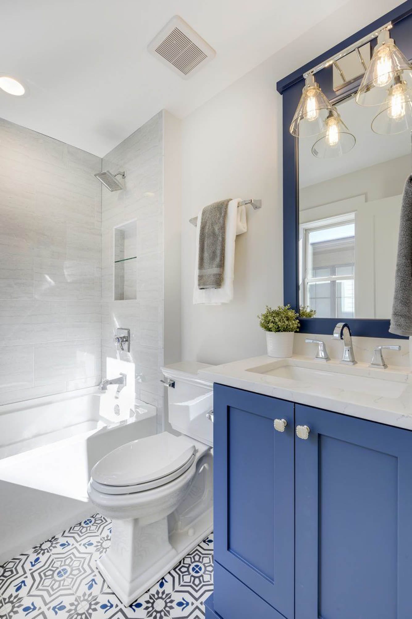
Featured: Talavera Encaustic. Design by The Divine Living Space. Photography by Spacecrafting.
Remember that using color doesn’t mean it has to be bright or bold. This soft, minty green brings a calming note to an otherwise neutral space.
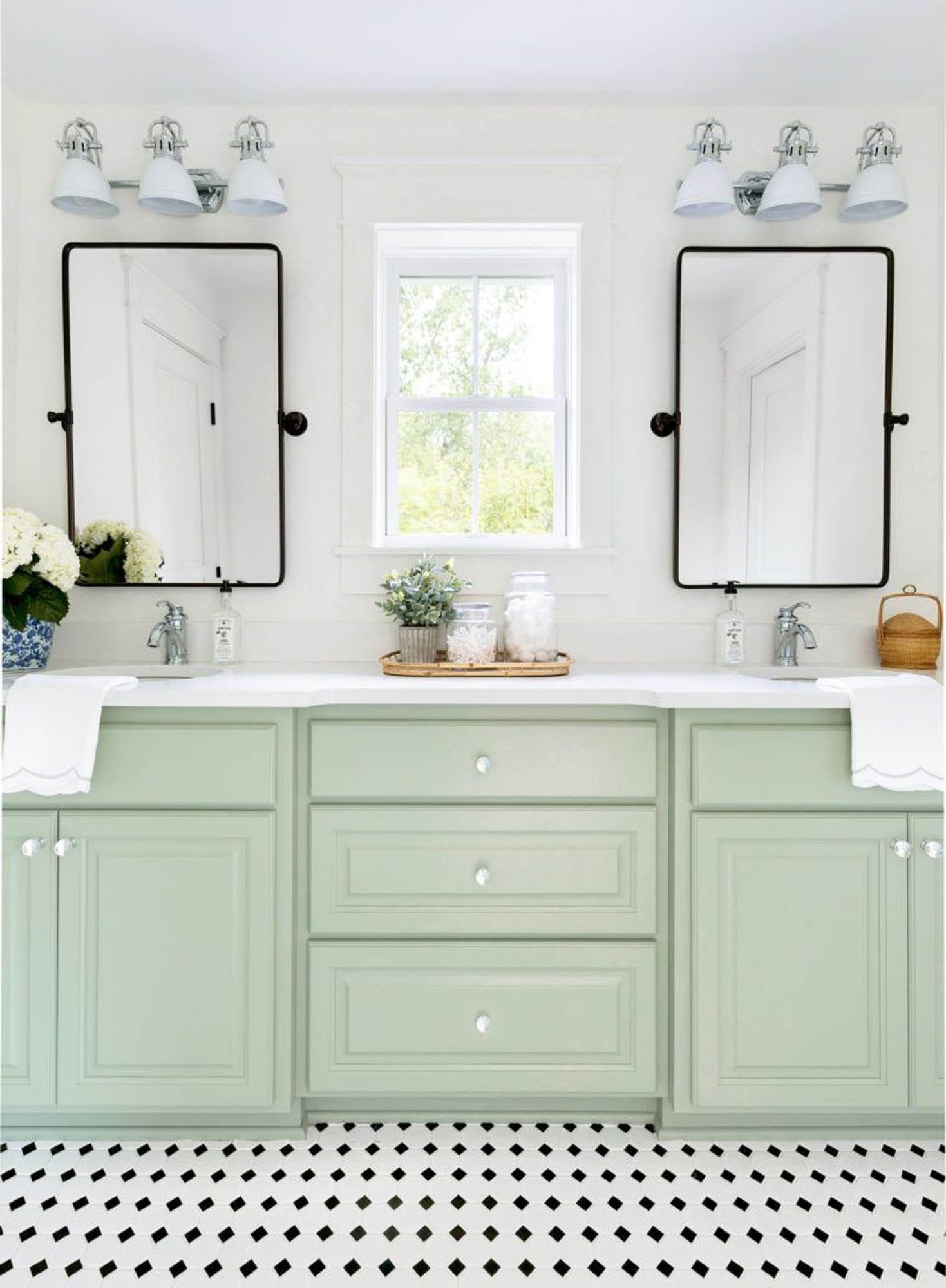
Featured: Octagon Matte White with Black. Design by Bria Hammel Interiors. Photography by Spacecrafting. Building by SD Custom Homes.
Here’s another example of coordinating tile and cabinet colors. This time, the navy trim piece is the inspiration for the cabinet color.
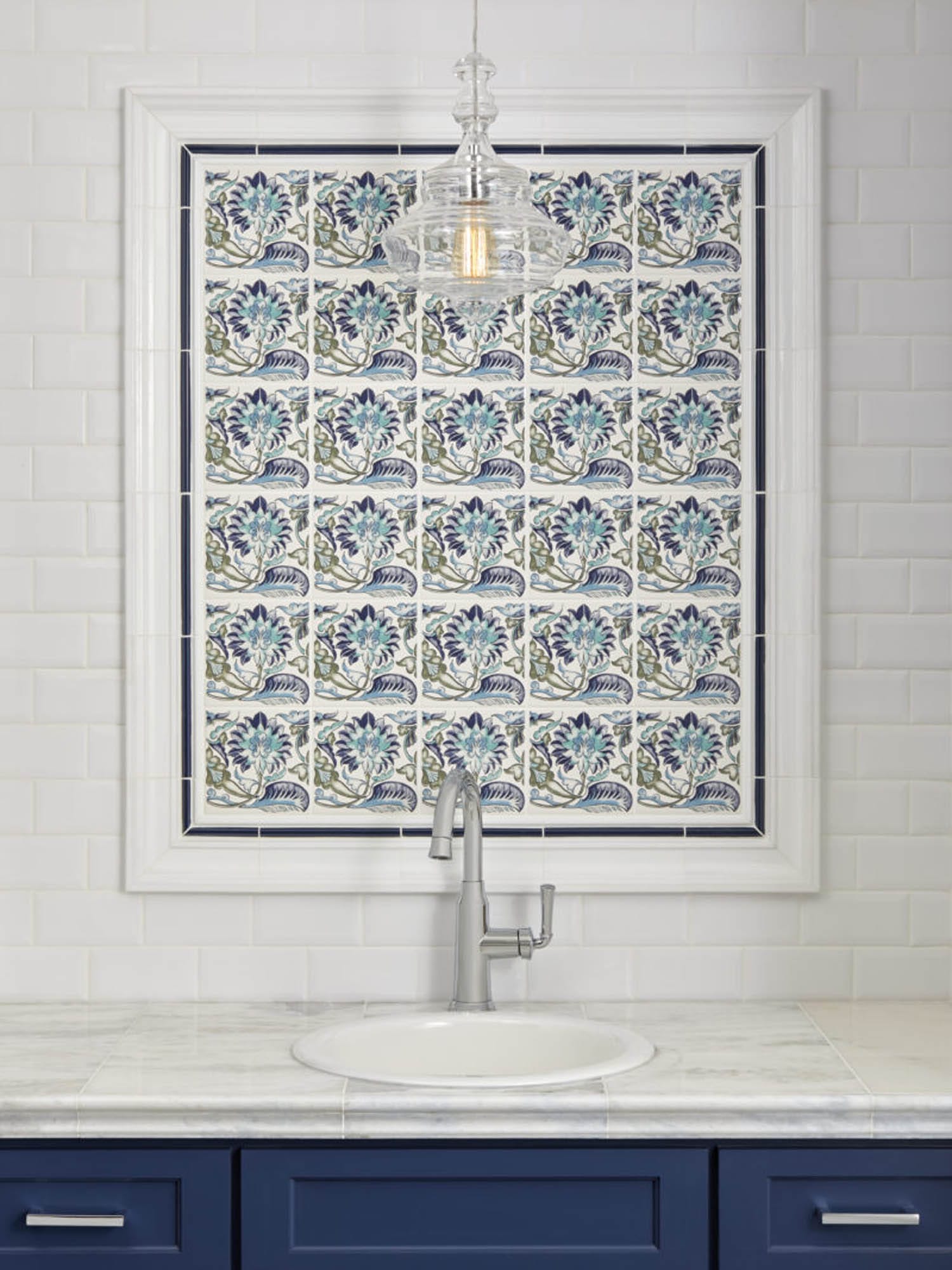
Featured: Victoria and Albert Morgan Blue Decor, Imperial Bianco Bevel Gloss, Imperial Bianco Barnes, Imperial Bianco Gloss Pencil, Imperial Cobalt Gloss Pencil
The turquoise tone below was pulled from the wood-look tile, making it more prominent.

Featured: Sambu Azul Wood Look. Design by Sublime Homes.
This dusty blue looks like it’s straight from a day spa’s color palette.

Featured: Firenze Calacatta Honed 4 x 12,Firenze Calacatta Honed 8 x 20, Firenze Calacatta Honed 12 x 24, Firenze Calacatta Honed Barnes, Firenze Calacatta Honed Bullnose, Firenze Calacatta Honed Somerset, Alato Beachwalk Chevron Mosaic
Bold Walls
Whether an unexpected color, a dark hue or a lively pattern, a statement wall speaks volumes—and is easier to pull off than you might think. This bold pink-and-black color scheme is lightened by white cabinets and woodwork. Don’t be afraid to experiment and have a little fun, especially in small-scale powder rooms.

Featured: Tempesta Neve Polished Wheaton with Black. Design by Timber Trails. Photography by Stoffer Photography Interiors.
Bold takes on a different meaning in this image. Instead of bright, this design is dark and glamorous. The intricate details and luxe gold touches make this room feel opulent from top to bottom.

Featured: Effect Dark AC, Camilla with Gold Antique Mirror Mosaic, Hampton Carrara Polished Chevron, Noir Polished Somerset, Glass Gold Liner, Dot Negro
If this bathroom makes you reconsider both dark walls and oversized florals, you’re not alone. Picking just one wall to cover in a print and coordinating that color with the floor keeps the space chic.

Featured: Hex Matte Black Mosaic. Design by Construction 2 Style.
An unexpected color can still create a clean and simple space. Opting for a darker tile mixed with white walls is the best of both worlds.

Featured: Dot Indigo and Matte White 1 in Mosaic. Design by Paro Home.
Mixed Metals
Decorating is all about coordinating instead of matching exactly. Gone are the days of using the same finish everywhere in a room. This mix makes spaces look intentionally eclectic and give them more personality. The simple combination of a stainless tile trim, matte black faucet and bronze-look mirror modernizes this farmhouse bathroom below.
The different materials of the lights and faucet are made hardly noticeable because they’re not right next to each other, and they both work with the style of the room.

Featured: Laura Ashley Wicker Dove Grey Matte, Imperial Brite White Matte Subway. Design by I SPY DIY.
A black faucet that coordinates with the light fixture lets the more glamorous mirror become the focus.

Featured: Adoni Black Slate Hexagon. Design by Morrissey Home Solutions. Photography by Jen Morley Burner.
Matte Black
A relatively new finish gaining popularity in the industry, the photos below prove the adage that every room needs a touch of black. Below, the matte black fixtures paired with the black recessed shelves lend the perfect amount of contrast.

Featured: White Hex, Hex Matte Black, Premium Antrasit
The lower half of this space is almost entirely outfitted in matte black, but the white walls and access to natural light fully brighten it up. White subway tiles and contrasting black grout coordinate with the matte black and tie the space together all the way up to the ceiling.

Featured: Imperial Bianco Matte, Hex Matte Black. Design by I SPY DIY.
Between grey subway tile walls, a wooden vanity and encaustic tile floors, there are a number of different colors and finishes happening here. Matte black accents, finishings and accessories unify with a cohesive feeling.

Featured: Imperial Oatmeal Gloss, Imperial Oatmeal Gloss Pencil, Imperial Oatmeal Gloss Skirting, Liria Negro Encaustic, Noir Polished Arabesque Travertine Mosaic
Sculptural Elements
These dimensional pieces, whether found in tiles, bathtubs or artwork, are designed to be aesthetically pleasing, like a sculpture. They are often simple and minimal with smooth lines and add an artistic component to a space. Below, this unique bathtub serves this purpose with its clean and sweeping lines.
The light fixtures in the space below are works of art.

Featured: Verona Blanco Polished, Camilla with Mirror Glass and Stone. Design by Russo Residential.
The combed, geometric design on this wall mosaic perfectly exhibits this trend in a soft way.

Featured: Bianco Puro Combed Hexagons Honed Mosaic, Bianco Puro Honed Somerset, Dural Chrome-Plated Brass Square Edge, Bianco Puro Honed
These wall tiles are a compelling way to make neutral walls stand out.

Featured: Memphis Bianco Di Elba
Below, this sculptural lighting fixture creates subtle, modern interest.

Featured: Liria Negro Encaustic, Imperial Brite White Matte Subway, Black Hex. Design by Timber Trails Homes. Photography by Stoffer Photography Interiors.
The sweeping movements of this tile take white walls from bland to beautiful.

Featured: Folhas Quartzo AC
Individuality
More and more we see people wanting their spaces to stand out from the crowd and speak to their own individuality. Something simple and neutral might be less intrusive to the next buyers, but will it make you happy for as long as you live in your home? Do what you love (and it just might be what sells the next homeowner). This gorgeous Milas Lilac marble is refreshingly unique and striking.

Featured: Milas Lilac Polished Chevron, Milas Lilac Polished Skirting, Milas Lilac Polished 8 x 20 in, Milas Lilac Polished Hex, Milas Lilac Polished Somerset
Another way to show your colors is to do just that—design with color. There are more options than ever to personalize with a spectrum of color choices.

Featured: Color Market Series
Expressing your individuality might also come in the form of a unique design made from different shapes and colors of tiles. Many of our collections are made to be mixed and matched into playful configurations.
If glamorous is your style, go all the way. This stunning mosaic sets the tone—elegant and feminine.

Featured: Monroe Marquina Mosaic, Black Marquina Polished Barnes, Black Marquina Polished 8 x 20, Black Marquina Polished Somerset, Firenze Carrara Polished Somerset
We hope you found inspiration in some of the latest bathroom trends. Still searching for ideas? Visit our bathroom tile idea page for more inspiration.
The post 6 Bathroom Trends to Try Now appeared first on The Tile Shop Blog.
]]>The post Trending Now: Blush appeared first on The Tile Shop Blog.
]]>
If you’ve noticed blush tones working their way into decor and design recently, you’re not alone. Whether in Goop’s feature on “The Pink Revolution” or the resurgence of a retro bathroom trend, people are talking about this hue. The popularity of this soft-but-not-too-soft shade of pink has grown in a big way in the last few years, and tile has not been immune to this trend. It’s easier than you think to tile a stunning space in pink. We’ll show you the different ways to incorporate blush into your design, whether as an accent or an all-over neutral, and make it your own.
The Old Pink
If you thought about pink a few years ago, your mind might have gone to a shade of mauve popular in the ’80s or a pastel, baby pink associated with nurseries. Like most colors, it has gone through evolutions and waxing and waning periods of being in fashion. The construct that pink is only for girls has existed for years, but the connotation is certainly changing.
“Pink is not a serious color. This is why I like to use it seriously. It is lovely and at the same time it brings in a certain distance, as if the decor made fun of itself.”—Pierre Yovanovitch, designer
The New Pink
Pink has never been as accessible as it is now. The shade can be feminine but doesn’t have to be. It pairs well with both bold and soft colors. Blush softens other intense neutrals like shades of brown, grey and black and is a compromise between a bold magenta pink and a saccharine pastel color. The new pink is neutral enough to be the perfect addition to any space. The blush tile in the photo below is a large-format size, adding an element of modernity.

3 Ways to Use Blush Tile
The effect of using blush in a tile design all depends on what you pair it with. With greys and other crisp neutrals, blush is a chic addition to an elegant space, like in the colorful but refined space below. In a large format or a metallic finish, it feels even more current. Blush can be a pop of color in a neutral space or a neutral shade in a bright, colorful palette. Here are our favorite ways to incorporate blush to get the style you’re looking for.

The New Neutral
Paired with other neutrals and simple details, blush serves as a modern, warmer neutral color in your palette. The below shower is a chic twist on a soft, all-over color that adds just the right amount of interest to a space. The textured design pops out from the rest of the shower without interrupting the simplicity of the monochromatic look.

We love the color palette in the image below. Soft grey, charcoal and white pair beautifully with the blush hues of Columbus Pink.

The pink tile below is so soft that it truly is a neutral. The overall effect is relaxed, chic and subtle.

Modern Elegance
London’s iconic Sketch restaurant is the perfect example of blush epitomizing modern elegance. Glittering gold and rose gold details, elegant finishings and blush pink are a winning combination. The shade is more welcoming than grey tones and feels utterly contemporary.

The color combination of blush and gold, especially in the subtle metallic paint splatter pattern below, is effortlessly chic yet fun.

Bold Accent
Combined with magenta and other bright colors, as seen in the photo below, blush works well with bold colors, livening up an otherwise neutral room. The abstract pattern of the glass tile (based on this colorful fabric) from the Annie Selke for The Tile Shop collection lends a playful, bright feeling to the shower.

If you just want to dip your toe into playing with blush, you can keep your tile design neutral and add pops of color with accessories, like the stool in the image below. The burnished gold finishings and crisp neutrals define the space in classic style with blush making the space feel current.

Here’s another way of incorporating a touch of blush into your design. Not only is it reflected in the art glass tile in the en suite, but the coordinating bedding and accessories allow blush to unite the space.

The Versatility of Blush
Just because blush is a trendy color doesn’t mean that you can’t make it your own. Using the Color Market Blush tile as our foundational pink hue, we set out to show how different a blush-based color palette can be using two designer collections from Pottery Barn as our inspiration.
This first mood board is undeniably elegant. Monique Lhuillier’s collection features hints of rose gold and a pared-down, modern color palette that benefits from the warmth and pop of color that blush adds. Crisp white, soft grey and cream round out the coloration of the collection.

It’s hard to believe the same shade of blush is the foundation for these two distinct color palettes. Turquoise blue, magenta and lime green accents cause blush to act as a neutral. Paired with bright, bold accent colors from the Lilly Pulitzer collection and a crisp white marble, this mood board exudes fun in a grown-up way.

Whether a dash of pink warms up your elegant space or a bright and colorful accent adds much-needed interest, today’s blush is far more versatile than the hues of the past. Explore our “Think Pink” Pinterest board for more inspiration.
Source of Pierre Yovanovitch quote: Architectural Digest
The post Trending Now: Blush appeared first on The Tile Shop Blog.
]]>The post Gilded Glamour: How to Tile in Art Deco Style appeared first on The Tile Shop Blog.
]]>
Featured Mosaics: Streamline, Moderne Deco, Skyline
Gilded Glamour, a Tile Shop signature style, blends 1920s art deco design elements with details of modern luxury—and, of course, stunning tile. A gilded touch, which literally means covered in gold, is a hallmark this style is based on. Think the opulence of the Great Gatsby meets the architectural style of the Chrysler Building with a thoroughly current point of view.

Photo by Jonathan Pease on Unsplash
Elements that Define Gilded Glamour
Commonly observed in visual arts, architecture and design, art deco first became popular around World War 1 in France. Then, it was the epitome of luxury, glamour and beautiful craftsmanship. Today, this timeless style still reflects these same aspirational qualities largely defined by five major design elements: geometric shapes, black and white, polished metal, mirrors and shine. Incorporating these elements into a design infuses a space with old-world elegance and allure.
Top Tiles to Get the Gilded Glamour Look
Select tiles from one or more of the below categories, and you will have more than enough inspiration for a Gilded Glamour space of which the Great Gatsby would be envious. Use our recommended products or employ these design elements to create a unique look of your own.
Geometric Shapes
Geometric shapes are defined by simple lines, curves or outlines. The versatility of these interesting shapes makes it easy to customize a look anywhere along the spectrum from subtle to bold. To achieve the Gilded Glamour look, use geometric shapes alongside another art deco design element, like black and white or touches of gold, to highlight the lines. Even with all three art deco design elements in the image below, the overall appearance is elegant and clean. Squares, diamonds, hexagons and any geometric mosaic tiles are a good place to start.
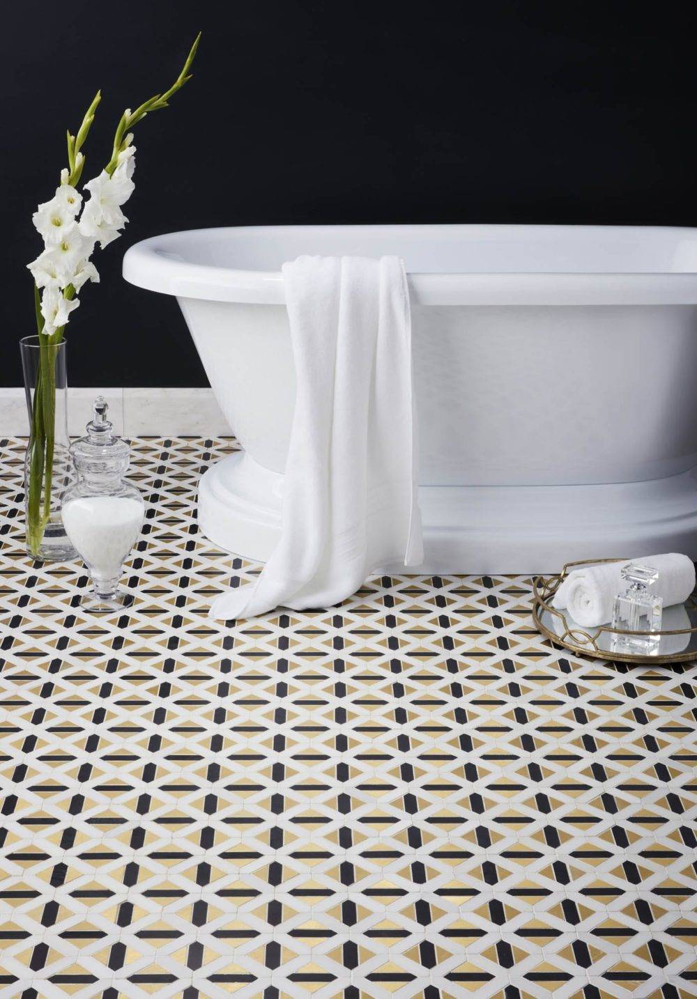
Featured: Corbusier Mosaic
Black and White
Tiling in black and white creates contrast, highlights shapes and lends vintage appeal to a design. Avoid too many bold elements competing in a space with a simple black-and-white base that provides simplicity. A black-and-white mosaic, a bold mix of black and white tiles or an all-over wall or floor in either hue are a few options that create varying degrees of boldness in your look. Black and white get an extra jolt of glamour when they’re in a reflective material or mixed with metal.
Polished Metal
Polished metals, especially gold, are a quintessential feature of Gilded Glamour style and perfect for adding a gilded touch. Incorporate a metallic accent almost anywhere, from tile to shower heads to the vanity. Hints of soft brushed gold peppered throughout the bathroom below tie the whole space together elegantly.

Featured: Tempesta Neve Marble Mosaic, Bulevar White, Tempesta Neve Somerset, Tempesta Neve Barnes, Tempesta Neve Amalfi Mosaic, Bianco Carrara Curb

Featured: Bulevar White
Dural metal profiles are another decadent way to sprinkle bits of metallic shine throughout a tile design. This subtle sparkle elevates the entire space.

Featured: Dural Metal Profiles, Ashford Carrara
Reflection
Not only does it open up a space, reflection adds an element of shine which perfectly complements the luster of Gilded Glamour. Plus, mirrors and reflective elements allow a small or dark room to feel brighter and lighter. As with all the elements of art deco, the extent to which you use mirrors is up to you. A touch of mirrored tile serves as an accent piece while a fully mirrored wall becomes a statement. Take a cue from this design. The mirrored tiles are a bold element so the rest of the design is simple and monochromatic.

Featured: Camilla w/ Mirror, Antique Mirror Bevel

Shine
Polished stone, iridescent finishes, metallic details—shine is an integral part of Gilded Glamour because it serves to add the luster that enhances a space. Polished marbles and other stones define rooms with subtle shine and retain a neutral hue while bright and bold tiles make a more dramatic statement. Pair tiles with shine with other reflective elements sparingly to avoid competing focal points. Below, the crisp white marble is the perfect complement that lets these gold tiles sparkle.
Our Take on Gilded Glamour
Inspired by a modern take on art deco, The Tile Shop’s design manager, Kirsty, envisioned an elegant bathroom with touches of gold and lots of rich marble. Since it’s impossible to create a display with every tile we carry, she used this inspiration to design a visual that would spark ideas for our customers. It turned out so beautifully that, before long, this design dream became a reality.

An artist’s interpretation of our Gilded Glamour bathroom.
This stunning design has everything we love about art deco in a softer, more modern style. The ornamental opulence of Gilded Glamour is visible in the touches of soft brushed gold and the art deco mosaic, which was inspired by a traditional motif. The floating vanity, light fixtures and cool-grey marble modernize the style. The sleek, rounded corners of the mirror mimic the shape of the mosaic and the gold accents coordinate throughout, effectively creating a cohesive look. Layered trims accent the Moderne Deco mosaic on the framed shower wall and in the functional recessed shelf, creating another luxurious detail.
The result is an elegant and soft take on art deco style that feels timeless and modern at the same time.

Featured: Moderne Deco, Verona Blanco, Roman Silver

From an idea to an artist rendering to a real-life installation, the evolution of this idea is dazzling.
Ready to add some modern Gatsby glamour to your space? Schedule a design consultation or stop into your closest store to get inspired and start your project today.
The post Gilded Glamour: How to Tile in Art Deco Style appeared first on The Tile Shop Blog.
]]>


