Spotlights
Spring One Room Challenge™ Reveal

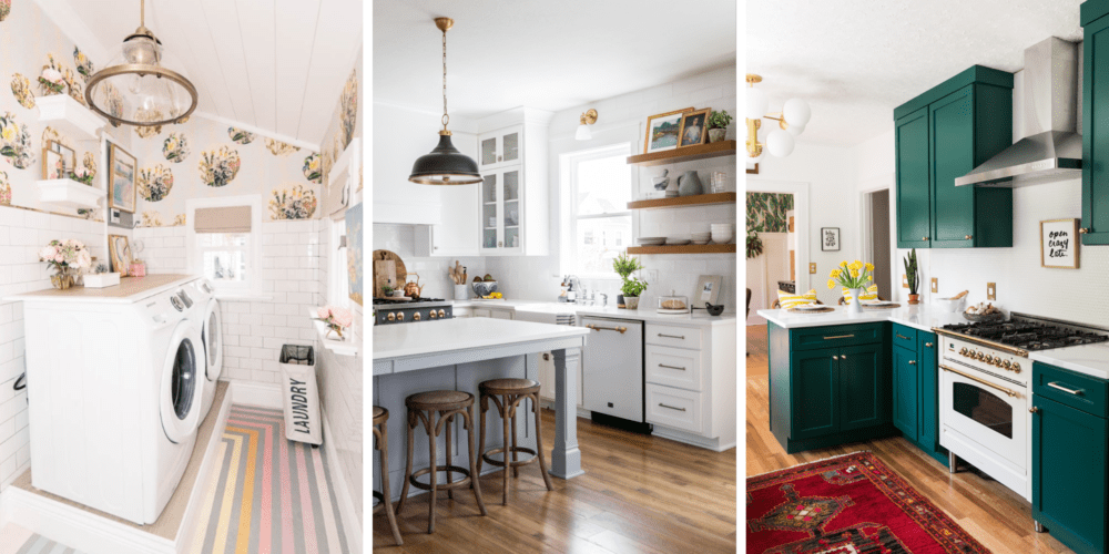
This spring, we had the honor of being an official sponsor of the One Room Challenge. Twice a year, 20 designers/influencers take on the challenge of transforming an entire room in just six weeks. Each week, the official participants share an update on the progress of the space. Luckily for us, the three designers we supported revealed some outstanding spaces at the end of the challenge. We hope you enjoy each of these spaces as much as we did!
At Home with Ashley
The first space by At Home with Ashley is one of the most uplifting laundry rooms we have ever seen. We realize that might sound like an oxymoron, but just see for yourself!


From classic white subway tile to rainbow painted flooring, Ashley incorporated numerous elements to bring this space to life. Ashley designed this space with so much bubbly character that it even had us wanting to invite ourselves over to do a few loads of laundry!

White subway tile is perfect for adding an attractive look to a space without taking attention away from bold accents and focal points. In Ashley’s laundry room, the tile perfectly supports the vivaciously patterned Euphemia 5 Wallpaper.

“To me, subway tile is still a classic look that feels very appropriate in our 1905 house. To modernize the tile, I added gold trim,” Ashley said. “The space feels so clean now with the walls of tile, which seems perfect for a laundry room!”
Visit At Home with Ashley’s Instagram or view her entire One Room Challenge space.
House of Jade Interiors
Picture a modern country kitchen—the type of kitchen that provides the perfect combination of warmth and charm. House of Jade Interiors took that idea and perfected it.


The magnetizing, modern and rustic features bring this modern farmhouse to a whole new level. While the backsplash reflects twenty-first century beauty, the tile’s handmade look and texture create a tranquil, artisan appeal.

We are obsessed with all of the organizational features in this kitchen. Take the center island for example— these gorgeous grey cabinets accent the white cabinetry and wood flooring perfectly.

House of Jade Interiors incorporated both glass cabinetry and open shelving in the images below. The combination of concepts truly give the feeling of modern farmhouse.

Notice the unique feature of tile inside the glass cabinets in the image above! We love this subtle feature because it adds texture and gives the enclosed cabinets a simliar feeling to the open concept cabinetry. If you love open shelving as much as we do, check out our Kitchen Trends for 2019 blog post.
Visit House of Jade Interiors’ Instagram or view their entire One Room Challenge space.
Jessica Brigham
Jessica Brigham’s wondrously green kitchen had us jumping for joy the moment we saw it! Jessica glamorized her 1934 craftsman bungalow kitchen while still paying tribute to its original, vintage character.

Check out the final kitchen reveal in the image below. The Forest Green cabinets are probably the highlight of this charming kitchen, but we can’t deny our love for the delightfully textured backsplash (even if we are a little biased). Let’s discuss the three reasons why we love this backsplash.

Firstly, the tile. The Penny Round Gloss White Mosaic wall displays a texture that is absolutely inspiring. Since the tile and grout are both white, the tile perfectly blends together—almost disappearing into the wall as if were an illusion. But if you look closely, the glossy finish seductively pulls you in.
Secondly, the counter-to-ceiling tile design. This trend is perfect for adding height and a cohesive look to your space. Even Jessica said installing tile from countertop to ceiling was the best decision she ever made.

Thirdly, the brushed gold and brass features. These accents of glam seamlessly fit in with the contemporary yet vintage kitchen. Notice the gold profile trim along the ceiling line in the image above and at the edge of the backsplash in the image below. These chic trim accents effortlessly united with the aged brass lighting and brushed brass wall plates.

“These itty bitty pennies brought in a subtly glamorous, glossy grandeur to the space—a little razzle dazzle, if you will.”—Jessica Brigham

Jessica’s colorful cabinetry just so happens to be one of our 2019 kitchen trends. Check out the rest of this year’s latest kitchen designs now.
Visit Jessica Brigham’s Instagram or view her entire One Room Challenge space.

Are you looking for more renovation inspiration? Check out these talented ORC guest participants: Sincerely, Marie Designs, Handmade Weekly, A Life Unfolding, This Minimal House, Porch Day Dreamer and Brush Colored Glasses.
Shop The Look
- Imperial Bianco Gloss Subway3 x 6 in. | Ceramic | 441955
- DURAL Plus Gold 24K24-Karat Gold | 329796
- Bulevar White Ceramic4 x 12 in. Ceramic | 494332
- Penny Round Gloss White MosaicPorcelain | 615814