Style & Design
Mid-Century Modern Style
Background
Unique among design styles, mid-century modern design can be traced back to a specific person. The history begins with Joseph Eichler, a real estate developer in California during the 1940s through the 1960s, who advocated and built more modern-style housing. Whole suburban neighborhoods of homes (called “Eichlers”) from this movement still exist in California and beyond today. Influenced by Frank Lloyd Wright, Eichlers often feature flat or A-framed roofs, vertical wood siding, clean and geometric lines, few street-facing windows, and large windows or skylights that let in light and nature. Their interiors introduced the country to exposed beams, concrete floors, sliding doors and en suite bathrooms. While we may take many of these design features for granted today, in postwar America, when people were used to mass-produced homes, architecturally pleasing Eichlers were a breath of fresh air. See some examples of this style, and read more about it here.

Why did this new style make such an impact that we’re still talking about it decades later? Many of the hallmarks of mid-century modern design still feel as fresh, clean and current today as they did in the 1950s:
- Open floor plans
- Simple, clean lines
- Neutrals (especially grey) combined with bright colors (especially orange and green)
- Floor-to-ceiling windows
- Simple furniture (similar to today’s Scandinavian style)
- Artistic items

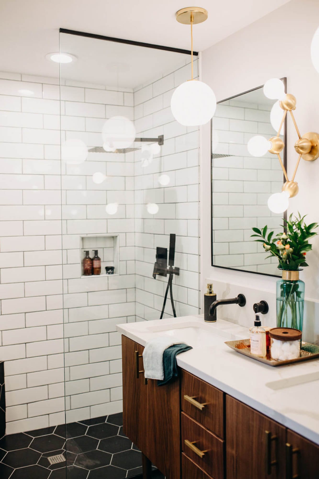
There are also some specific things you can look for to determine mid-century tiles:
- Color, especially rich colors like green and orange
- Geometrics
- Fan shapes
- Organic shapes
- Metal edging
- Handcrafted, artisan look
- Straight stacked subway tile
- Beveled and framed subway tile
- Large-format tiles
Let’s look at how some real spaces use these mid-century modern elements. You’ll notice that a lot of the trends overlap from picture to picture which goes to show that these elements are true hallmarks of mid-century modern design!
Color
Who doesn’t love a pop of color?! Whether featured in tile, cabinetry, fabrics or accessories, have fun with your design and include something bold and bright (bonus points for rich colors like orange and green).


Geometrics
Geometrics are another style that often appears in mid-century modern design. There are as many different ways to use geometric tiles as there are geometric tiles available. Use one color, mix and match or stick with neutrals for a more subtle approach to geometry.


Straight Stack
The most common and classic layout for subway tile is the brick-lay pattern. (Learn all about subway tile patterns on our blog post about the topic.) A more contemporary and mid-century modern way to install rectangular tiles is the straight stack. It features a clean layout and straight, even grout lines.


Organic Shapes
Handmade-look tiles, an artisan feel


Explore more design styles on the blog or our website. Loving mid-century modern for your next project? Book a design appointment to get started today!